Preface
This blog post is based on my talk at the BlinkOn 14 conference (May 2021). You can watch the talk here:
And the slides are available here: Towards richer colors in Blink - slides.
This article will talk about the ongoing efforts to specify richer colors on the Web platform, plus some ideas about directions for future development on Blink/Chromium.
Introduction
The study of color brings together ideas from physics (how light works), biology (how our eyes see), computing, and more. There is a long and rich history following the desire to be able to use richer materials and colors when creating visual art, and the same is true of the Web today.
A color space is a way to describe and organize colors so they can be identified and reproduced with accuracy. Some color spaces are more or less arbitrary (e.g. the Pantone collection) but the ones that we will focus on are based on detailed mathematical descriptions.
These color spaces consist of a mathematical color model that specifies how colors are described (i.e. as tuples of numbers) and a precise description of how those components are to be interpreted.
The range of colors that a hardware display is able to show is called its gamut. When we want to show an image that uses a larger color space than this gamut, its colors will have to be mapped to the ones that can be actually displayed: this process is called gamut mapping.
Essentially, the colors in the original image are “squeezed” so they can be displayed by the device. This process can be rather complex, because we want the image being displayed to preserve as much of the intent of the original as possible.
When we talk about software, we say that an application is color managed when it is aware of the different color spaces used by its source media and is able to use that information when deciding how that media should be displayed on the screen.
Traditionally, the Web has been built on top of the sRGB color space (created in 1996) which describes colors with a RGB color model (red, green and blue) plus a non-linear transfer function to link the numerical value for each component with the intensity of the corresponding primary color.
There are many other color spaces. The graph below represents the chromaticity of the CIE XYZ color space, which was specifically designed to cover all colors that an average human can see.
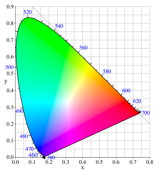
Source: WikiMedia
From that large map of colors within human perception, we can identify those that fall within the sRGB color space.
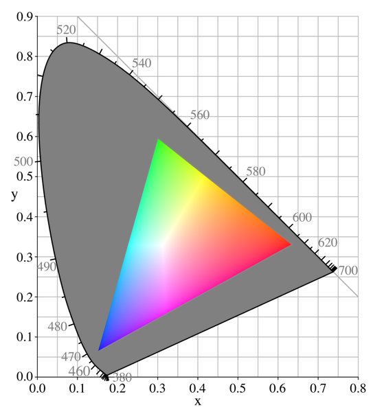
Source: WikiMedia
As you can see, there are many colors that we can perceive but can not be described by sRGB!
Learn more: Color: From Hexcodes to Eyeballs (Jamie Wong)
(Note: these graphs are a useful tool to visualize and compare different gamuts but sometimes can be a bit confusing, because they use colors that we can obviously see but then tell us that some of the colors represented by them are outside the gamut that our device can display.)
Colors on the Web
The sRGB color space gained popularity because it was well suited to be displayed by the CRT monitors that were common at the time. CSS includes plenty of functions and shortcuts to define colors in the sRGB space, for example:
#40E0D0rgb(218, 112, 214)PeachPuffrgba(211, 65, 0, .8)hsl(177, 70%, 41%)LightSkyBlueSee also: Color CSS data type
As technology has improved over time, nowaday many devices are able to display colors that go beyond the sRGB color space. On the Web platform there is increasing interest in adding support for wider color gamuts to different elements.
Learn more: Unlocking Colors (Brian Kardell), LCH colors in CSS: what, why, and how? (Lea Verou)
Several JavaScript libraries already provide a lot of functionality for manipulating colors (but are limited by the limits of what can be displayed by the browser).
See: Color JS, D3 d3-interpolate, chroma JS.
The major Web browsers offer different levels of support for color management and access to wider gamuts.
This article will focus specifically on adding support on Blink and Chromium for richer colors in elements defined in HTML and CSS.
CSS Color
The reference specification for richer colors on the Web is the CSS Color Module elaborated by the CSS Working Group. CSS Color Module 4 describes most of the changes discussed here and CSS Color Module 5 will bring additional functionality.
There is as well a Color on the Web community group at the W3C that among other things organises a workshop on wide color gamut for the Web.
In 2020 there was also a very interesting discussion at the W3C’s Technical Architecture Group about how having colors outside of the sRGB gamut opened up questions about interoperability between the different elements of the platform, as well as interesting observations around how to support calculations for improved color contrast and accessibility.
(Note: this list does not pretend to be exhaustive and it intentionally leaves aside the many groups working on standards beyond CSS and beyond the Web in general.)
The CSS Color spec, among other things:
- extends the
color()function to let the author explicitly indicate the desired color space of a color, including those with a wide gamut; - defines the
lab()andlch()functions to specify colors in the CIE LAB colorspace; - provides detailed control over how interpolation happens, as well as many other features;
- contains a reference implementation for the operations described in it.
So why is this a big deal?
Display more colors
First, using only sRGB limits the range of colors that can be displayed. Many modern monitors have a wider gamut than sRGB, often close to another standard called Display-P3.
Here you can see both of those spaces over the same graph that we saw before:
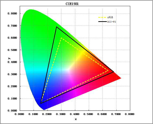
The Display-P3 space is about one third larger than sRGB. This means that from CSS we have no access to roughly one third of the colors that modern monitors can display.
Learn more: Why DCI-P3 is the New Standard of Color Gamut?
See also: Wide-gamut color on the web
This is another way of visualizing the same idea, where the white line in each case represents the boundary between what can be described by sRGB and what is within Display-P3.

As you can see, the colors that fall within the Display-P3 space but outside of sRGB are the most intense and vivid.
Learn more: Wide Gamut Color in CSS with Display-P3 (WebKit)
When a Web browser is not able to display a color because of hardware and/or software limitations, it will use instead the closest one of the colors that it can display.
Let’s see an example of this. The image on the left below is a uniform red square in the sRGB gamut. The image on the right is slightly different, as it actually uses two different shades of red: one that is within the sRGB gamut and another that is outside of it. On sRGB displays, both colors are painted the same and the result is a uniform red square, just like the first image. However, on a system that can display wide-gamut colors, both shades of red will be painted differently and you will be able to see a faint WebKit logo inside the square.


Source and more information: Comparison between normal and wide-gamut images (WebKit).
Furthermore, there are color spaces that are even larger than Display-P3; for now, they are mostly reserved to professional equipment and applications, but it is likely that at some point in the future some of them will probably become popular in their turn.
Adding wider color spaces to the Web is as much about supporting what widely available hardware can do today as it is about setting us in the path to support what it will do in the future.
Consistent and predictable colors
Secondly, another limitation of sRGB on the Web is that it is not perceptually uniform: the same numeric amount of change in a value does not cause similar changes in the colors that we perceive.
We can see this clearly with HLS, which is an alternate way to express the same sRGB colors in terms of hue, saturation, and lightness. Let’s see some examples.
Here 20 degrees in hue are the difference between orange and yellow:
HSL(30, 100%, 50%)HSL(50, 100%, 50%)Whereas here that same step produces very similar blues:
HSL(230, 100%, 50%)HSL(250, 100%, 50%)Changing the lightness value may also change the saturation that we perceive (even when its numerical value stays the same).
HSL(0, 90%, 40%)HSL(0, 90%, 80%)And colors with the same saturation and lightness values can be perceived very differently because of their hue:
HSL(250, 100%, 50%)HSL(60, 100%, 50%)Learn more: Color spaces for human beings
This means that in general sRGB (and by extension HSL) can not be used to accurately adjust lightness, saturation or hue, to find complementary colors, to calculate the perceived contrast between two colors, etc.
One of the new functionalities in the CSS Color spec is to be able to use color spaces where the same numerical changes in one of the values brings similar perceived changes, like the LCH color space.
LCH is based on the CIE LAB color space and defines colors according to their Lightness, Chroma, and Hue.
In the LCH color space, the same numerical changes in a value bring about similar and predictable changes in the colors that we perceive without affecting the other characteristics.
Changes in lightness:
LCH(45% 60 60)LCH(60% 60 60)LCH(75% 60 60)Changes in chroma (or “amount of color”):
LCH(50% 10 319)LCH(50% 60 319)LCH(50% 110 319)Changes in hue:
LCH(50% 70 35)LCH(50% 70 135)LCH(50% 70 280)Learn more: LCH colour picker
See also: Perceptually uniform color spaces
Interpolation and more
Since color spaces represent and organize colors differently, the path to reach one color from another is not the same on different spaces. This means that there are many possible ways to interpolate between two colors to create e.g. a gradient. For example:
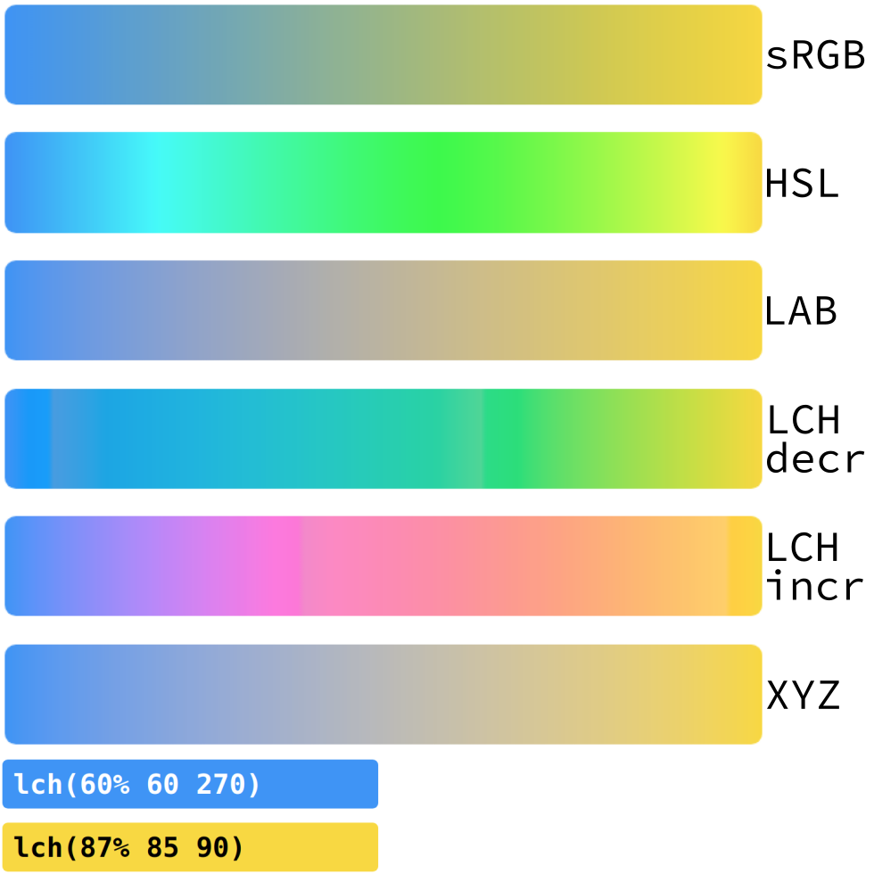
Try it out: Color JS - interpolation
The CSS Color spec will provide more control over interpolation on additional color spaces. This is just one example where adding richer color capabilities to the Web dramatically broadens the range of tools available to authors when creating their sites.
Learn more: Interpolation on CSS Color 4, Mixing colors on CSS Color 5.
Color in Chromium
Now let’s talk about Chromium. As you know, it is the Free Software portion of the Chrome and Edge Web browsers.
The Web engine inside of it is called Blink and it implements the Web Platform standards that describe how to turn Web content into pixels on the screen.
Blink itself is a fork of WebKit, which is the Web engine used by Safari and others.
Render pipeline
Blink basically creates a rendering pipeline that takes Web sources as input (pages, stylesheets, and so on).
It parses them, applies styles, defines geometry, arranges the content into layers and tiles, paints those and sends them over to be displayed.
This job of actually painting those pixels is carried out by a multiplatform graphics library called Skia.
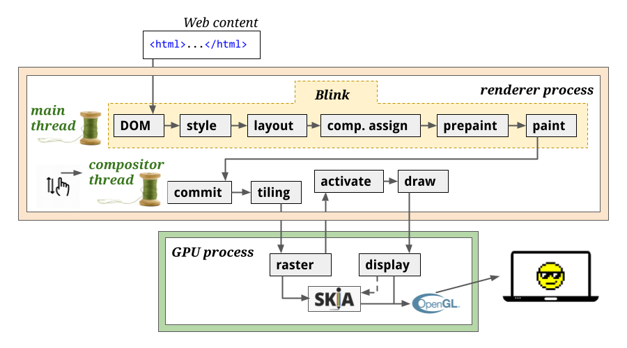
Learn more: Life of a Pixel (Chromium team).
Richer colors
In Chromium, there is already some support for color management, @media queries (gamut), color profiles (tags) in images, and so on.
Learn more about embedded color profiles in images: Digital-Image Color Spaces (Jeffrey Friedl).
There is now also an intent to experiment with additional color spaces for canvas, WebGL and WebGPU.
However, there isn’t yet support for using richer color spaces with individual Web elements like we have seen in the previous section.
Within Blink, CSS colors are parsed and stored into a small structure with just 32 bits: that means 8 bits per RGB color channel (plus 8 more for transparency).
See:
color.h(Chromium).
These colors are eventually handed over to the Skia library to carry out the actual drawing. Skia then uses its own similar 32-bit format.
See:
SkColorin SkColor.h (Chromium).
We can show this on the previous diagram. A Web page specifies a color in sRGB which is stored in a 32-bit format and passed across the rendering pipeline until it reaches Skia, where is is converted to a similar format, rastered, and displayed.
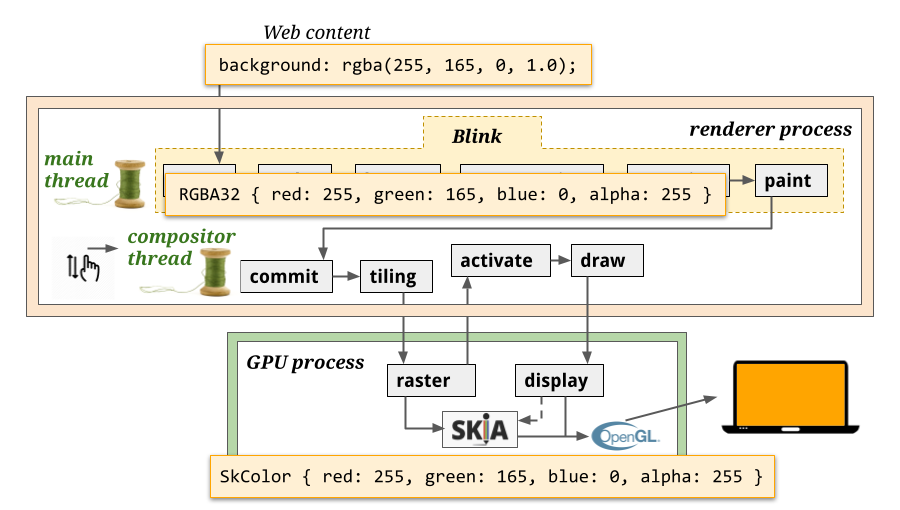
This means that thoughout Blink’s rendering pipeline colors are represented using only 32 bits, and this limits the precision and the richness of the colors that can be used and displayed in websites by Chromium.
Some ideas from WebKit
Blink started as a fork of WebKit in 2013 and although they have evolved in different ways, we can still look at WebKit to get some inspiration for storing and manipulating high-precision colors.
Without getting into too much detail, WebKit supports a high precision representation of colors that stores four float values plus a colorspace. LAB is one of those spaces that may be used to define colors in WebKit.
Learn more: Improving Color on the Web, Wide Gamut Color in CSS with Display-P3 (WebKit).
See also: Color.h, ColorComponents.h and ColorSpace.h (WebKit).
Having this support for higher precision colors has already made it possible to implement several color features in WebKit, for example:
lab(),lch()andcolor(lab …); details at Safari technology preview 120color(a98-rgb …),color(prophoto-rgb …),color(rec2020 …),color(xyz …),hwb(); details at Safari technology preview 121color-contrast()andcolor-mix()from CSS Color 5; details at Safari technology preview 121
An importabnt difference is that WebKit uses the platform’s graphic libraries directly (e.g. CoreGraphics on Mac) whereas Chromium uses Skia across different platforms. Support for displaying colors beyond the sRGB gamut may not be available in all platforms.
High precision colors in Skia
Interestingly, Skia does not have the same limits in color precision and range as Blink does.
Internally, it has a format for high-precision colors that holds four float values, and it is also able to take color spaces into account.
See:
SkRGBA4fandSkColor4finSkColor.h.
Much of the Skia API is already able to take as input a colorspace and one or more high precision colors defined in it. Skia is also able to convert between source and destination color spaces, so colors can be manipulated with flexibility before being adapted to be displayed on concrete hardware.
In Skia, a color space is defined by a transfer function and a gamut. See:
SkColorSpace.h.
So, Skia is able to paint richer colors on hardware that supports them.
This means that, if we managed to get that rich color information defined in the Web sources at the beginning of the pipeline all the way to Skia at the end of the pipeline, we would be able to paint those colors correctly on the screen :)
However, two more things would be needed in order to implement the full functionality of the CSS Color specs. First, Skia’s representation of high-precision colors still uses the RGBA structure, so out of the box Skia does not support other formats like LAB or LCH.
Secondly, as we have seen, the CSS Color spec provides ways to specify the interpolation colorspace for gradients, transitions, etc. Blink relies on Skia for this interpolation, but Skia does not provide fine-grained control: Skia will always use the colorspace where the source colors have been defined, and does not support interpolating in a different space.
These point towards the need for an additional layer between the Blink painting code and SKia that is able to translate the richer color information into formats that Skia can understand and use to display those colors on the screen.
Summary
As a very broad summary, the first step to support wider, richer color gamuts in Blink is to parse the CSS code using those new features.
Those wide gamut colors and their colorspaces need to be stored in a high-precision format that can be used throughout Blink’s rendering pipeline.
At the end of the pipeline, it needs to be translated so Skia can paint those colors correctly in the desired hardware. For this, we will also need more fine-grained control over interpolation and probably other changes.
This work is not straightforward because it would touch a lot of different components, and it might also have an impact on memory, on performance, on how paint information is recorded and used, etc.
For Web authors it is important that these features are available at the same time, so they can rely on the new functionality provided by the CSS Color spec.
In Closing
I hope that with this you got a better understanding of the value of adding richer colors to the Web and the scope of the work that would be needed to do so in Chromium.
These are some steps in the long road to increase the expressivity of the web platform and to widen the range of tools that are available to authors when creating the Web.
Thank you very much for reading.